Showing posts with label creme. Show all posts

Wednesday, October 19, 2016

Fantasy Makers Bloody Marie

Gosh, I feel like every week I work on this blog, I learn something. Like just now, I learned that, while it's great to take pictures and schedule posts ahead of time, sometimes you need to be wearing the polish while you edit the pictures because you can't remember what color it really is
It could be any of these! Just kidding, it's definitely not as dark the upper left box, but I think it's not as bright as on the right. Lower left is probably the most color-accurate. Not that you're likely to find this polish around, anyway...
It's a Fantasy Makers by Wet N Wild, and as far as I can tell, they don't appear to be a thing this year! They weren't even that impressive last year; I saw all four for $2 each at Rite-Aid and bought them all, mostly because I thought the bottles were cute, and Bloody Marie here turned out to be the best one. The others are a crappy black that I frankened with clear polish to try to turn into a jelly, a crappy white, a glow-in-the-dark that only glows in the bottle, and this red jelly that is basically a dupe for China Glaze Masai Red. 
.
 Since I didn't have that many pictures of Bloody Marie, and the ones I have are ridiculous, I thought I'd better flesh out this collage with some pics I took of Wet N Wild Black Creme. Since it's the only polish I see at the Wet N Wild Halloween makeup displays this year, I guess it's officially a Halloween polish now, huh? In the upper left is the black Fantasy Makers polish, Black as Knight; that is not what I'm wearing on my nails. Black Creme is a great polish, Black as Knight sucks and was a streaky, watery mess before I even messed with it.

 I took these when I wore Black Creme under Bali Mist, so they are summer sun pictures and my nails were still pointy. This was the indoor pic under my horrible old bulb. I decided to go for it and just make the picture black and white...I mean, holding black polish with black nails in a black and white photo is a great idea, right? Friday will continue our spooky nail polish times with another black polish.


Saturday, October 8, 2016

Saturday Nail Art - Are You Plaid to See Me?

So first off, you might notice in this nail art something I alluded to earlier in the week: a change in my nail shape. Yep, I filed 'em square. I did this for a few reasons; I had a peelie on my left hand that looked like it was going to get worse, I had a hard time filing my points evenly and wanted something neater-looking, and even though I never hear anyone talk about this, it's been my experience that pointy tips get tip wear faster. Your mileage may vary.
 As you probably guessed from this post's hilarious title, this week I was inspired to do some plaid nail art. Remember last week, when I inadvertently switched Zoya Bay and Cupcake Bat-chelor Pad? It actually worked out for the best this week, too. I started out by hand-painting striped of Bat-Chelor Pad and Wet N Wild Be More Pacific over a base of China Glaze Bend Over Backwards, which would not have gone as smoothly if I'd been trying to use a texture.
 I love this color scheme, makes me think of old wool blankets. I stamped with Konad White, as usual, and the plate was from Born Pretty.

To me, this is probably the most successful nail art I've had on the blog yet. I only did it on four fingers, but I would definitely recreate it maybe as an accent nail. Next week might get a little awkward, as I have three holos to swatch and the weather is starting to turn gloomy. I'm about to get daylight bulbs and invest in a second lamp so I can take better indoor pictures, since that's what I'm going to be stuck with starting in a month or so. Fortunately, next week's polishes are super sparkly, super holographic, and gorgeous in any light!

Wednesday, October 5, 2016

Wet N Wild Be More Pacific

OK, so my nails look wrecked in this post. Because I don't wear a base coat when I swatch, cremes show every flaw in my nails. Later in the week, you'll see a change in my nail shape, and these pics are part of the reason why.
As for the polish itself, I actually really like this one. It's a nice thick two-coat creme, and the color is right between green and blue. Also it was like seventy-five cents or whatever. Cupcake Polish also has a polish called Be More Pacific, but this one came first. I think this is a beautiful color and perfect for summer. I don't have a lot to say about this one, come back Friday for something shinier.

Saturday, September 17, 2016

Saturday Nail Art - Chevrons

So, against all odds, the nail art I made from this week's polishes turned out...kind of OK?
 Nina Ultra Pro Art Walk, if you recall, is a hot pink creme with bright blue microglitter that just doesn't look right. Revlon Artsy has quite noticeable large bright blue glitter, and it seems like the colors actually go together (in a tacky sort of way). The subdued pink of Astra separating the two saturated colors ties it all together. I actually kind of like this.
I didn't remember to do a step-by-step for this art, but basically, I started with a base of Astra and then I used Scotch tape. Pretty simple. Join me next week when I finish up the A's!

Friday, September 16, 2016

Cirque Astra

So I swear I'm not some indies-only nail snob. It was not intentional that both the mainstream polishes (one salon, one drug store) would be hideous and the indie would be one of my absolute favorite polishes. I didn't invent the alphabet! Today just happens to be Cirque Astra.

 I had some indoor photos too, but the colors were off and just didn't do justice to this polish. I love taking pictures of Cirque Astra (my very first Instagram posts were of this polish!), and when I get my indoor lighting setup figured out, I'll probably take some more pics of it.

Astra, like Acid Wash, is from Cirque's Spring 2016 Speckled and Sparkled collection. The silver and charcoal specks make it look so much like marble when it's shiny; mattified, it reminds me a lot of easter candy, specifically those little chocolate eggs with the chalky candy carapace. Astra has the best formula of the four speckles, in my opinion. I considered leaving Astra out of this week's art, because it's clearly in a different league than the other two polishes, but I decided to just go for it. Come back tomorrow to see the art!

Monday, September 12, 2016

Nina Ultra Pro Art Walk

Today's polish is incredibly ugly. It's...just look at it!
I paid I think $2.79 for this, and I want my money back. Nina Ultra Pro Art Walk is a bizarre hot pink with electric blue microglitter scattered throughout it. It looks strange in the bottle and appallingly ugly on the nail.

OK, so maybe I am being a little harsh on Art Walk. The above photos are without base and top coat, and I don't usually wear anything without base and top coat (except maybe Zoya Pixie Dusts). Let's see if Art Walk is redeemed by a coat of Seche.

It's actually much better with top coat. The blue glitter just comes off looking kind of like dirt in the base color, though. I can see why someone would think this combo would work, it sounds like it would have a 90's sort of lovable neon horribleness. I don't know if the base of this polish is too thick or if it's something with the glitter itself, but either way, this has a KBShimmer A-Blazing-esque resistance to sparkling.

If it sparkled, that would be different. I'm not doing this project with any intent to destash anything, but I am assembling a mental garbage pile as I go along, and right now I'm imagining myself throwing Nina Ultra Pro Art Walk into it. It's too bad, because hot pink is one of the few varieties of pink that I like on me. Come back on Wednesday to see another dud...uh, I mean, another interesting polish.


Saturday, September 10, 2016

Saturday Nail Art - Green Blobs

Sounds great, right? I was pretty stuck about this nail art. I did all the swatches for this week back in August, right after I got back from vacation, and I did not think I was going to be able to make nail art for this combination of polishes. Alluring Rose was messing me up. I did swatches of a franken I'd made and was going to post those instead, but all the photos turned out crappy. Fortunately, I came to the realization that Angel Kiss is green and Appletini is green, so let's just forget about Alluring Rose and do a green-on-green blobbicure.
 I had to redo a couple of nails because the thing about blobbicures is, they take their sweet time to dry. I mean, it's a blob of polish, so yes this is common sense and I should have known better.You can also see on the ring finger where I added an extra dot of polish after I'd top coated; this was not a good idea either.
I still wouldn't go so far as to call this a nail fail, because I do like the way it turned out. Not sure why I initially thought these colors wouldn't work together. That's part of the fun of this blog anyway: giving myself permission to make ugly things! I'm also going to be swatching some fuggo polishes next week, so if you're a fan of hideous things, be sure to stop by!

Friday, September 9, 2016

NYC Appletini

So on Wednesday, I said that this polish was the opposite of Color Club Angel Kiss. This is NYC Appletini, a polish I bought on a whim at Winco while grocery shopping. It's a creme that's so very saturated that it's eye-catching, where Angel Kiss was a grayed-out metallic that would be really unitneresting without its holo flame. Look at this yellow-green beast.
I have a couple other long-wearing NYCs, and while I really like the brand's In A Minute formula, I dislike my other two long-wearings. They have a runny, slow-drying formula. Appletini has a creamier formula, although the first coat always has a lot of bald spots. Two coats gives perfect coverage and makes your nails the color of a not quite ripe Granny Smith apple.

I had my first ever appletini on vacation in New Hampshire with my boyfriend's family. I got wrecked and totally killed at foosball. That has nothing to do with this polish. Come back on Saturday to see the weekly nail art!

Wednesday, August 24, 2016

Nina Ultra Pro Ahoy Matey

Ahoy, mateys! Today's polish is a runny blue creme from weird brand Nina Ultra Pro!

I found this polish randomly at Sally on clearance. Sally Beauty Supply is the only place I have ever seen this brand, so I have just a few of them.
3 Coats
 I haven't been blown away by any of the ones I have, but I am impressed by the ginormous brush. I love a wide brush (like the Sally Hansen Complete Salon Manicure, Wet N Wild Megalast, or Baroness X brushes), but this one is as wide as a Swiffer. 
I needed to use three coats, because the formula is quite sheer. It applied well, though, and it's a pretty dusty blue. Aside from the enormous brush, there's not much to say about this brand or this polish. 


Tuesday, August 23, 2016

Cirque Acid Wash

Today's polish is from spring of this year, part of Cirque's Speckled & Sparkled collection.
It's actually the only one I had left untried
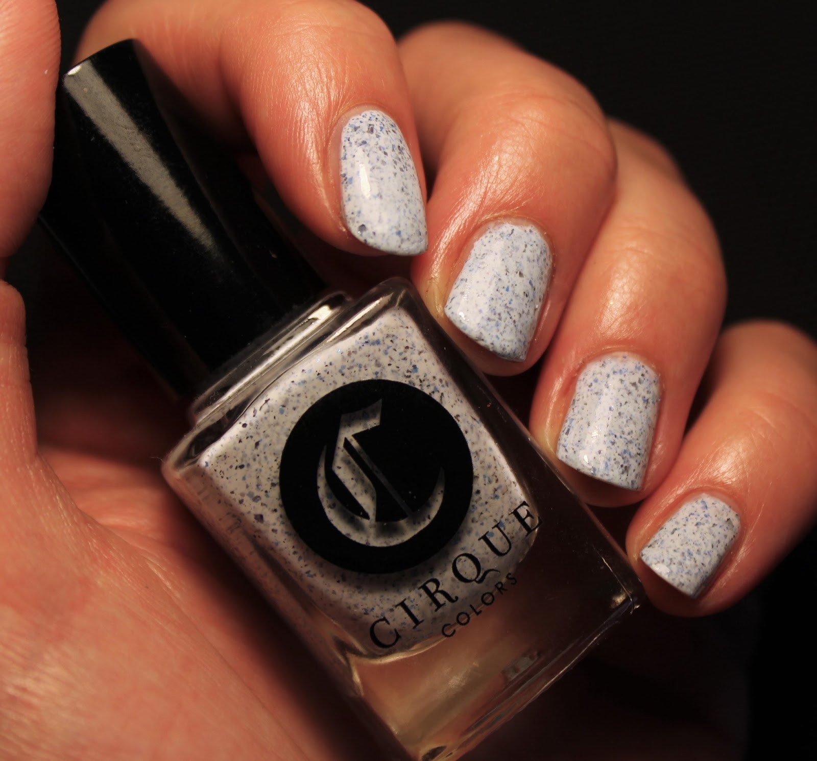
I had heard good things about Cirque, but had held off buying any until this collection. I picked up all four of the speckles, which are all crellies with little pigmented and metallic flecks in them. Acid Wash has blue and silver speckles in a white base, and it resembles a fancy countertop. 
I love this finish so much, and Acid Wash has a beautiful color scheme. All the speckles are among my favorite spring polishes. 
One downer about these polishes is they all have kind of a chunky formula. The base is slightly thicker than it should be, meaning that doing more than two coats is useless, since the flecks stop showing through. At the same time, it's almost always necessary for me to do three coats to get the polish even. These have a quick-drying (as in, "dry while you're applying them" quick) formula, and they don't self-level as well as I'd like. I think it's worth wrestling with them because they look so awesome.


Wednesday, August 17, 2016

OPI A-Taupe the Space Needle

Here's another polish from an OPI two-pack. I bought this one when I had maybe one brown in my collection and was trying to fill it out a little, used it for nail art once maybe, and then kind of wrote it off. Swatching it, I was surprised by how much I liked it!
Indoors and edited
I've honestly never been that big on OPI. I think the names are cumbersome and annoying, I don't like cremes that much so I was never that into their formula, and I think most of their collections are repetitive, uninspired, and dull. I do get the appeal, and I'll admit, the formula on this polish really did impress me. When people describe a formula as "buttery," with a smooth application, perfect consistency, thick enough to stay put and not run but thin enough to spread easily over the nail...this polish is a sterling example. It is perfectly buttery.
Another thing that really shocked me was how much I liked the color on me. It's a greenish brown that's very wearable on my cool, pink skin. It's got an olive undertone to it. In the bottle, it looks like a much more straightforward brown. My only complaint about this polish is the name, which is incredibly stupid and also annoying to type AND ALSO not the least bit accurate. A-Taupe the Space Needle is from a collection with all travel-themed names, and it seems like once OPI locks themselves into a naming scheme, sticking with that is more important than what the colors actually are. This isn't taupe, like, at all. Taupe is like a grey brown, and this is a slightly green tinted brown. I just googled taupe to see if I was being too hard on OPI, and I learned that the word comes from the French for "mole." The other bottle in this two-pack just so happened to be the even more horribly named Gaining Mole-mentum! That's kind of weird! Join me Friday for another KBShimmer polish and another first for the blog...my first holo!

Monday, August 15, 2016

KBShimmer A-Blazing

Today's polish is from one of the most well-known and beloved indie brands, KBShimmer, yet it's still obscure. It's called A-Blazing, and it's a creme with sparse, scattered shimmer particles. I've got to say...it's not one of my favorites.
It's pink.
This polish was an exclusive from A Box, Indied. The very last A Box, Indied, as a matter of fact, from June 2016. I had seen swatches of all the polishes before I decided to buy the set, but bloggers didn't say that A-Blazing was pink. It was supposed to be orange; one person described it as coral, but it sounded like a coral-leaning orange with orange sparks of shimmer. It is not.
The box's theme was campfire stories, and all the other polishes were named after spooky urban languages. A-Blazing was supposed to represent the campfire itself, an idea I really like. I feel like KBShimmer, as an enduring brand that has acted as a gateway to indie polish purchasing for many people, earned the right to occupy the central space. Unfortunately, I'm not really into the polish itself. The formula was great (this is 2 coats but with careful application, one would suffice), but the color, yikes. I also always find it kind of ironic that KBShimmer is a brand that is not known for its shimmer polishes, and in fact the shimmer in this is the weakest element. There is a little bit of sparkle in the sun, as you can see in the lower right of the collage, but it's not very much. The shimmer is somehow too subtle and obtrusive at the same time, and this is because it doesn't dry smooth. It's not textured or anything, just a little bumpy, but still. If I was into pink cremes, I would love the formula on this polish but still be a little disappointed with the chunky shimmer. I've got to give this one a meh. Things will look up Wednesday, though, with a polish that I found to be a pleasant surprise.