Wednesday, August 31, 2016

Bonita All Things Blue

Today's polish is another neon, again without undies. It's Bonita Salon All Things Blue, and it's three coats of lovely summery loveliness.
Bonita is kind of a mysterious brand. I only ever see it at Rite-Aid, and these Bonita Salons showed up in the summer season. They are a "gel-like" polish, but unlike every other gel-like polish I can think of, there was no top coat sold with them. They do have a top coat, I've just never seen it on display. Even without a gel-like top coat, I got good wear out of this polish; I wore it as a pedi over vacation and went a week without chips.

You can actually buy Bonita products online at http://www.bonitacolors.com/ (not affiliated). Even though I've always thought of them as cheapo impulse buy polishes, they actually do have some neat polishes (unfortunately, awesome golden holo glitter Golden Girl is not on the website). I also want to note that this is the first time I've had trouble capturing a polish's actual color. It's actually darker and not as sky-blue as it photographed. Check out Friday's post for another blue polish.

Monday, August 29, 2016

OPI All Sparkly and Gold

Today's polish is another mini. Unfortunately, this is an OPI mini. Like I said, I'm not a huge fan of OPI in general anyway, and their minis are kind of notorious.

The tiniest bottleI had to check my spreadsheet to make sure of the name of this polish, since the hilariously small bottle doesn't even have room for a name sticker. The little fluffy brush makes application a real pain in the butt, but the formula was quite good.

This is another gold texture, but it's less of a yellow gold and more metallic than NOPI A Heart of Gold. While I am a fan of gold polish and textured polish, this is another one that I got in a pack of minis. I have three other polishes from the Mariah Carey Holiday 2013 collection; I bought these on a whim from Amazon, I think the pack was $5.

With top coat, it's even more sparkly. I tend to overlook my minis, since I don't keep them within my Helmer, but this is a lovely polish and works as well in the summer as the holidays. Wednesday I'll have a much more season-appropriate polish.

Saturday, August 27, 2016

Saturday Nail Art - Marbled Marble

Have I mentioned how much I love my Simply Neat mat? Well...I love my Simply Neat mat. For today's nail art, I used it to make some dry-marble decals.
I marbled Cirque Acid Wash, Nina Ultra Pro Ahoy Matey, and Essie All Access Pass together using a small brush, and sandwiched the marble between coats of Wet N Wild Clear Nail Protector. When I make decals, I always make a few extra because I know I'm going to screw up some of them. I only needed four usable ones, and here they are.
The one thing I don't love about making decals is cleaning up. I need to get some of those little curved scissors so I can trim the sides, because dissolving a large amount of decal with acetone is gross. I put down a peel-off barrier to mitigate the dryness, but I still always end up with a goopy mess on my fingers. 

I wasn't sure that All Access Pass would look good with the other two polishes, since they're blue, but I think it turned out surprisingly nice. I also did some stamping over this art, check out my Instagram if you want to see it.

Friday, August 26, 2016

Essie All Access Pass

Today's polish is a mini that I bought in a four-pack at TJ Maxx. It's Essie All Access Pass, from the summer 2015 neons.

I swatched this one with 3 coats and no white undies, even though it is supposedly a neon. I don't feel qualified to judge whether or not something is a neon, but I think these Essies aren't bright enough to count. It was opaque in two coats, but since I've worn this before and I'm about halfway through the bottle, the formula has gotten a little goopy and I needed the third coat to even out the surface.
I've got three more of these neons, and I think this one is probably my favorite. It's a very pretty, bright summer purple that's just a little more saturated than the pictures show. I might hunt down a full-size of this once I'm through with the mini. Join me tomorrow for the week's nail art!

Wednesday, August 24, 2016

Nina Ultra Pro Ahoy Matey

Ahoy, mateys! Today's polish is a runny blue creme from weird brand Nina Ultra Pro!

I found this polish randomly at Sally on clearance. Sally Beauty Supply is the only place I have ever seen this brand, so I have just a few of them.
3 Coats
 I haven't been blown away by any of the ones I have, but I am impressed by the ginormous brush. I love a wide brush (like the Sally Hansen Complete Salon Manicure, Wet N Wild Megalast, or Baroness X brushes), but this one is as wide as a Swiffer. 
I needed to use three coats, because the formula is quite sheer. It applied well, though, and it's a pretty dusty blue. Aside from the enormous brush, there's not much to say about this brand or this polish. 


Tuesday, August 23, 2016

Cirque Acid Wash

Today's polish is from spring of this year, part of Cirque's Speckled & Sparkled collection.
It's actually the only one I had left untried
I had heard good things about Cirque, but had held off buying any until this collection. I picked up all four of the speckles, which are all crellies with little pigmented and metallic flecks in them. Acid Wash has blue and silver speckles in a white base, and it resembles a fancy countertop. 
I love this finish so much, and Acid Wash has a beautiful color scheme. All the speckles are among my favorite spring polishes. 
One downer about these polishes is they all have kind of a chunky formula. The base is slightly thicker than it should be, meaning that doing more than two coats is useless, since the flecks stop showing through. At the same time, it's almost always necessary for me to do three coats to get the polish even. These have a quick-drying (as in, "dry while you're applying them" quick) formula, and they don't self-level as well as I'd like. I think it's worth wrestling with them because they look so awesome.


Saturday, August 20, 2016

Saturday Nail Art - Cherry Blossoms

Today's nail art was done spur of the moment, after I had finished swatching the week's polishes. Word of warning: I was suffering from some noticeable dryness at this point, so a lot of these photos have been retouched. I started out pretty uninspired, and my first attempt was...uh, indefensible.
I have no idea what I was thinking with this
I saw that what I was doing was hideous, stopped myself, and thought it over. I had a beautiful neutral base, a brown creme, and a coral creme with shimmer. Suddenly, it became obvious: cherry blossoms!
In progress
I was so excited by this revelation that I didn't think to get in progress shots like last week. Basically, I just used a detail brush to draw branches using OPI A-Taupe the Space Needle, then a dotting tool to add flowers with KBShimmer A-Blazing, on a base of KBShimmer Acetone it Down. Here's a collage of the finished product, sun shots on the right and shade on the left:
I'm holding the bottle of A-Blazing in all these shots because this nail art really redeemed it in my eyes. When I swatched it, I was horrified at its pinkness. Combined with the other two colors, it read as the orangey-red I had wanted it to be all along. I really like the way this turned out, I didn't expect these colors to go together at all. Join me next week for some blues!

Friday, August 19, 2016

KBShimmer Acetone it Down

Today's polish, like Wednesday's, has a punny name. However, not only does this polish's name actually describe it well, it's also simple, cute, and easy to type: Acetone it Down.


Acetone it Down is a holo, but it's a soft one. The base is creamy, smooth, and just a little sheer; sheer enough that the holo particles are visible through the polish, but opaque at two coats with really excellent coverage. This is another one with a stellar formula. It's also another exclusive, kind of; this is one of KBShimmer's "misfit" line of polishes, which are versions of the regular collections that didn't turn out as they should have. Acetone it Down is a version of a nude holo that got a little too much grey in it.
Like the name says, the polish is toned down. It's not a loud, bright, crazy linear holo; it's very soft and demure. The website calls this one a taupe, which it is, but I was really delighted when I put it on because to me, this is a greige. A greige holo! Isn't that cool? It's such a pretty polish that I didn't want to take it off...so tomorrow's nail art was done over the top of it. Come back Saturday to see the transformation!

Wednesday, August 17, 2016

OPI A-Taupe the Space Needle

Here's another polish from an OPI two-pack. I bought this one when I had maybe one brown in my collection and was trying to fill it out a little, used it for nail art once maybe, and then kind of wrote it off. Swatching it, I was surprised by how much I liked it!
Indoors and edited
I've honestly never been that big on OPI. I think the names are cumbersome and annoying, I don't like cremes that much so I was never that into their formula, and I think most of their collections are repetitive, uninspired, and dull. I do get the appeal, and I'll admit, the formula on this polish really did impress me. When people describe a formula as "buttery," with a smooth application, perfect consistency, thick enough to stay put and not run but thin enough to spread easily over the nail...this polish is a sterling example. It is perfectly buttery.
Another thing that really shocked me was how much I liked the color on me. It's a greenish brown that's very wearable on my cool, pink skin. It's got an olive undertone to it. In the bottle, it looks like a much more straightforward brown. My only complaint about this polish is the name, which is incredibly stupid and also annoying to type AND ALSO not the least bit accurate. A-Taupe the Space Needle is from a collection with all travel-themed names, and it seems like once OPI locks themselves into a naming scheme, sticking with that is more important than what the colors actually are. This isn't taupe, like, at all. Taupe is like a grey brown, and this is a slightly green tinted brown. I just googled taupe to see if I was being too hard on OPI, and I learned that the word comes from the French for "mole." The other bottle in this two-pack just so happened to be the even more horribly named Gaining Mole-mentum! That's kind of weird! Join me Friday for another KBShimmer polish and another first for the blog...my first holo!

Monday, August 15, 2016

KBShimmer A-Blazing

Today's polish is from one of the most well-known and beloved indie brands, KBShimmer, yet it's still obscure. It's called A-Blazing, and it's a creme with sparse, scattered shimmer particles. I've got to say...it's not one of my favorites.
It's pink.
This polish was an exclusive from A Box, Indied. The very last A Box, Indied, as a matter of fact, from June 2016. I had seen swatches of all the polishes before I decided to buy the set, but bloggers didn't say that A-Blazing was pink. It was supposed to be orange; one person described it as coral, but it sounded like a coral-leaning orange with orange sparks of shimmer. It is not.
The box's theme was campfire stories, and all the other polishes were named after spooky urban languages. A-Blazing was supposed to represent the campfire itself, an idea I really like. I feel like KBShimmer, as an enduring brand that has acted as a gateway to indie polish purchasing for many people, earned the right to occupy the central space. Unfortunately, I'm not really into the polish itself. The formula was great (this is 2 coats but with careful application, one would suffice), but the color, yikes. I also always find it kind of ironic that KBShimmer is a brand that is not known for its shimmer polishes, and in fact the shimmer in this is the weakest element. There is a little bit of sparkle in the sun, as you can see in the lower right of the collage, but it's not very much. The shimmer is somehow too subtle and obtrusive at the same time, and this is because it doesn't dry smooth. It's not textured or anything, just a little bumpy, but still. If I was into pink cremes, I would love the formula on this polish but still be a little disappointed with the chunky shimmer. I've got to give this one a meh. Things will look up Wednesday, though, with a polish that I found to be a pleasant surprise.


Saturday, August 13, 2016

Saturday Nail Art - Golden Giraffes

All the polishes this week went pretty well with each other, so I did a more elaborate look than last week. I took step-by-step pictures for this week. I can't guarantee I'll always remember to take step-by-step pics, but I will try to do it every once in a while.
I started with a base coat of Monday's polish, OPI 50 Years of Style. I decided to do a smoosh mani using 50 Years and Wet N Wild 9021Orange. I painted my ring and pinky nails using Nicole by OPI A Heart of Gold. The smoosh marbling didn't work super great because 9021Orange is much thinner than 50 Years of Style.
To combat the sheerness, I blobbed the polish directly on my nails and then smooshed it with my stamper. Eventually, I just dabbed 9021Orange onto the nail and left the blobs to dry. It's a fast dry polish, so this actually worked. In the last pic, I've got 9021Orange on A Heart of Gold, and all my nails have been mattified. At this point, I had kind of a gold and orange giraffe thing going on, which, it turns out, nicely complements the stamping image I put on last. 
Stamped with Konad Black + Wet N Wild Black Creme
BP-L010 is the strange Born Pretty stamping plate I used. On the website, it's called "Aztec Plate," yet the images are dreamcatchers and giraffes and pi inside a target that's partially covered in bacon? It's a very, uh, interesting plate. It's good quality, and picking up the images was fairly easy (even with my worn out stamper). I like the way this mani turned out! It was just dumb luck that these polishes ended up being in the same week, and I think doing this weekly nail art is going to get more challenging and I will probably end up cheating and rearranging polishes to avoid making anything too hideous. Monday will be another first: the first indie polish, not counting that horrible picture of Vapid Spellcaster in the first post.

Friday, August 12, 2016

Nicole by OPI A Heart of Gold


Today's polish has a bad reputation. I mean, the specific polish has no reputation that I know of...

It's Nicole by OPI A Heart of Gold
But it's part of two controversial categories. First, it's a NOPI. NOPIs aren't popular, and I believe it's because of the obnoxious bottle shape. It's got a rounded back and a flat front, so NOPI bottles don't fit in any drawer with any other polish or indeed with others of its kind. The brush in mine also sucked.
This brush has a more pronounced C-curve than my nails
I don't think I've talked about where I've gotten most of my polishes, but I will say where I bought this one. It was at a Walgreens, for $2.19. This Walgreens no longer carries NOPI, so I guess I bought it during a stock liquidation, As an aside, you know what store does still carry NOPI? My local Ulta. Why? Why can't they focus on their Zoya selection or getting new China Glaze collections faster? 


The second divisive aspect of A Heart of Gold is that it's a textured polish. Textures are a love or hate proposition for a lot of people. AHoG has a fine, sandy texture similar to a Zoya Pixie Dust, my favorite kind of texture. I have some chunkier textures that kind of bug me. Of course, if you're anti-texture, you can always slap on some top coat.
Like so
AHoG is sparklier with top coat, since like most textures it dries matte. One coat of Seche Vite is enough to smooth it completely because of its fine grain.

 So I don't like NOPI as a brand, but I do like textures and I like the formula of this polish. These pictures are three fast-drying coats. Sadly, I also don't like the color that much. It's gold, but it's such a yellow gold that I don't like the way it looks on me very much. I had some problems with my lighting, apparently, because no two of these photos turned out to be the same color and they were all too dark. So I know you can't tell what color this is from my photos, but it is not very gold and not metallic at all and not shimmery. It's a yellowy texture. I had more positive feelings for this polish after I swatched it, but before I wrote this post. I'm surprised I wrote so much about this! I think if I write any more about this polish, I'll talk myself into hating it! That's all for A Heart of Gold. Tomorrow is nail art Saturday, so read to see how I put this week's polishes together.

Wednesday, August 10, 2016

Wet N Wild 9021Orange

Today's polish is another Wet N Wild, this one has a great terrible pun for a name: 9021-Orange. It's a lovely orange glass fleck. 
Indoor pics
 This one came out with a whole collection of other colors with bad TV show puns for names. I snagged this one because it's gorgeous, although it is annoyingly sheer. All these pics are 4 coats.
4 coats!
 I feel like it's very likely that Zoya has an orange glass fleck that probably takes fewer coats (Tanzy? or Amy?), and I love this one so much that I think I might pick it up.
Mattified, it gets all glowy and also kind of reminds me of carrots. I wouldn't have described it as a carroty-orange when it was shiny, but matte, it just seems brighter and less golden. 

Because it's so sheer, I wonder how this would look as a topper over a red, orange, or yellow creme. I've frankened with this, but hadn't worn it before and I love it! It's a really pretty shimmer in a beautiful color. Join me on Friday for the blog's first textured polish!


Monday, August 8, 2016

OPI 50 Years of Style

Today's post is another gold polish, OPI 50 Years of Style. I'm not a huge OPI fan, so all the ones I have, I bought on sale. 50 Years of Style came from an $8 two-pack at TJ Maxx.
It's metallic
The other polish in the 2-pack was a re-labelled glitter called "Golden Waves." TJ Maxx sometimes has old OPIs that have been renamed; I've read that they're polishes that are from collections that were associated with a particular celebrity or brand. When the license runs out, the polish has to be renamed, was the theory. That makes sense, although I wonder why 50 Years of Style not only didn't get renamed, it still has the horse-patterned wrapper on the cap. (I've also never been able to figure out what Golden Waves originally was - maybe by the time I get to the G's, I'll have some readers and someone will recognize it)

I'm always looking for nice gold polishes. This one I bought some months ago and never got around to wearing. I actually like it a lot! This is two coats. It's slightly sheer and has a very smooth, fast-drying formula. I'm not usually a person who mattifies all the things, but I thought 50 Years might glow a little under a matte top coat.


Honestly, I don't have a lot to say about this polish. It's nice, but nothing really special. Join me Wednesday for something orange!

Saturday, August 6, 2016

Saturday Nail Art - Stamping

Part of the point of this blog is to wear polishes I wouldn't have otherwise gotten around to. I've just shown swatches up to this point, but I think part of getting to really know a polish is using it for nail art. I didn't find the time to do anything really ornate this week, but I did want to see if Sally Girl 24 Karat would stamp well.
I edited this pic a bunch, but I didn't add the lens flare. That was in the picture already and I thought it looked cool.
Stamping isn't something I'm an expert at; even using a clear stamper, I have a hard time lining up the image on my nail. I used two images from the Uber-Chic succulents mini-stamp plate. I love succulents, so this was the first stamping plate I felt like I had to have. 
Stamped with Konad White and Sally Girl 24 Karat
The plate has a lot of cute images on it. I picked a design that actually appears twice on the plate in different sizes; the small one is perfectly pinkie-sized. I swear I'm going to stop blabbing about how my nails used to be long, but I actually swatched this week's polishes on them before the break. They turned out looking pretty bad, and I didn't get sunlight shots, just desk lamp. I thought I would show a couple even though they suck and I didn't edit them.
L: The plate
R: My nails dwarfed that tiny bottle :(
Join me next week when I resume swatching and eventually get to a polish whose name starts with a letter!


Friday, August 5, 2016

Wet N Wild Megalast 2% Milk

Today's polish is a sheer nude. It's a well-loved, accessible, affordable, and effective YNBB (your nails but better) polish from classic cheap drugstore brand Wet n Wild. I bought this because it came so highly recommended by the nail community, even though I hate sheer nudes. I don't want my nails to look milky and shiny! It grosses me out, just like actual milk. Maybe it's not so much a YNBB; maybe it's more of a YNBS (your nails but slimier). This is the slimiest polish in the galaxy.
This is a heavily edited photo. 
This kind of polish is seen as essential that everyone should have in her collection, though. It's versatile, subtle, and is appropriate for a wide range of situations. If you need a sheer nude to round out your collection, you could certainly do worse than 2% Milk.


In the end, I have to say I do like this polish. It applies really well, with very little streaking and no dragging. I did 3 coats for the pictures, but I wish I had left it at 2; more layers make the polish more gelatinous-looking, rather than more opaque. To really make this one shine, you need a matte top coat.

I edited this with the Windows 10 image viewer, so it's technically not Photoshopped..

Speaking of cheap-yet-high-quality drug store polish, here's NYC Matte Me Crazy on top of 2% Milk. Mattifying gives it a frosted-glass look that I love. I'm not a huge matte polish person, either; there's just something about this color with this finish that makes me feel like my nails are made of porcelain. I feel like the daintiest.


The plan for tomorrow is to show nail art made using this week's polishes. It's nothing super fancy, but I wore it all day and kept admiring it (even though I'm still missing my long nails). Check out tomorrow's post to see.


Wednesday, August 3, 2016

Sally Girl 24 Karat

Hello again! So in my introductory post, I didn't outline the premise of this blog. Basically, I'm going to be swatching polish from my stash and posting pics and thoughts on Mondays, Wednesdays, and Fridays. On Saturdays, I'm going to post nail art that is hopefully made from that week's polishes (unless they are completely fuggo together, in which case I have some alternate features planned). I'm going to post in roughly alphabetical order; this blog was almost called something like “alphanailmeric,” but I didn't want to commit to only swatching in alphabetical order and also that name looks stupid.

Without further ado, here's today's polish: Sally Girl 24 Karat!
Indoor lighting
For those of you who aren't familiar with this brand, Sally Girl is sold only at Sally Beauty...or was, it's actually been discontinued recently and replaced with something else. Not the most auspicious polish to start with, now that I think of it!


Sally sold these little tiny bottles for 99 cents, which made them both temptingly cheap and a complete rip-off. Swatching this basically emptied my bottle, although in 24 Karat's defense, I did a mani with this prior to nubbing. I considered putting the pics here, but trust me, they are terrible. 24 Karat is a perfectly average gold foil; there's absolutely no point in reviewing it, since you're not likely to find it anywhere, and the tiny brush is pretty miserable to use anyway. 
That was my first set of swatches! Join me Friday for a polish that is the opposite of this one in a lot of ways (by which I mean, you can and should buy it)!

Monday, August 1, 2016

Welcome to My Blog!


Hello, world! Welcome to my blog, Unsweetened Nails! I decided to start a blog for a couple of reasons: first, because I am trying to get back into writing, and maintaining a blog seems like a good way to stay interested and active; second, because I have over 500 bottles of nail polish and no intention to stop buying more, and blogging about my collection is a great way to justify having/expanding it! I'll be honest here: I took these pictures over a week ago, and since then I have been agonizing about starting a blog. What am I going to write? Am I really going to post these sub-par photographs that were clearly taken by someone who has no clue what she is doing? Am I good enough to be a nail blogger?

I have a motto, though, that I default to in times of uncertainty. My motto is "Go for it!" Let's face it: if you don't do something, it doesn't get done. If you want to start a blog, go for it. Maybe in a couple years, I will have readers who will look at this post and wonder, "Why isn't this blog called 'Neurotic Nails'?" Right now, it's just me and my goals. Without further ado, allow me to introduce my stash.

My Helmer and various stuff
This is my Helmer. It was originally grey, but prior to assembly I spray-painted it with some granite-style paint because I thought it would look cool. It didn't really turn out! In the clear container, I keep base coats, top coats, miscellaneous treatments, and minis. I'll show the pink box on the left in a minute.


My dresser top
This is the top of the dresser I share with my boyfriend. You can see my swatch-stick collection and some perfume and Bath and Body Works sprays (I collected BBW stuff before I got into polish; my job has fragrance restrictions but no one cares what I have on my nails, so that's convenient). The dresser top is where I keep all my ILNPs. The top drawer of my Helmer is my indie drawer, but before I took all the ILNPs out, it was basically the ILNP drawer.


Spicy Tiger
This is the pink box that I keep on the left side of that clear container. I think it was originally a box that Influenster sent me panty liners in, but I covered it with some pink crepe from inside a Birchbox and taped a tiger that I cut off the front of a box of tea (Bengal Spice, IIRC). The little drink umbrella adds a touch of class. In this box, I keep top coat refills, Seche Restore, a big thing of Bliss Kiss Simply Pure, and the eye dropper and syringe that I use to refill my bottles.

Here be swatch sticks!
This is the profoundly stupid way I store my rings of swatch sticks: on a novelty Halloween pirate hook.

My workstation
Formerly a dining room table that we kept tabletop games on, this spot is now where I do my nails. I've got my Simply Neat mat, a couple of lights (I am still working on my lighting situation, as you will see from the next photo), jars of brushes and Sharpies, acetone and fake Remove +, scissors, body butter, other nail art supplies (in the container on the left), and a box with commonly-used base coats, top coats, and treatments (particularly Orly Cutique, which I try to use weekly). I keep my file out here, and cotton balls to remove polish with. The black thing under the light has Cards Against Humanity decks in it, but I use it as a backdrop for photos. It's a work in progress.
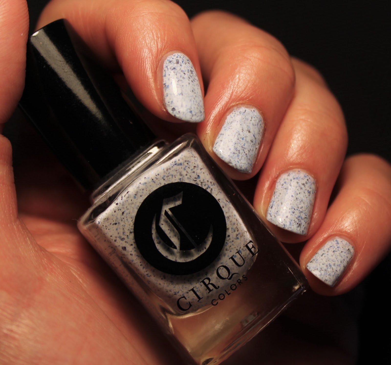
Vapid Spellcaster
Last but not least, here is a photo of the polish I was wearing when I took all these pics. This is how my nails looked when I decided to start a blog. This is not how they look now, but you'll see more of them on Wednesday. Welcome to Unsweetened Nails, I hope you like what you see and stick around for more!